
It’s the color of royalty, a signal of wealth and power—and interior design’s hottest color in 2018.
Sure, purple might inspire you to hum a few tunes from (or mourn once more) that musical genius from Minneapolis. But it’s also a fresh shade with a strong personality and lots of versatility, says Olivia Rassow, style editor at Birch Lane, an online retailer of furniture and home decor.
And homeowners are catching on.
“Jewel-inspired tones have been trending in the marketplace,” says Misty Yeomans, senior color marketing manager at PPG paints. “These colors, including the purple hues, evoke feelings of elegance and grandeur, which appeal to consumers.”
But too much of this grape hue could backfire in your home, much like a Barney-themed birthday party run amok. Instead, ease into the trend with some smart advice from the pros. Here are seven ways to introduce this year’s hottest color into your home decor.
1. Paint a purple accent wall
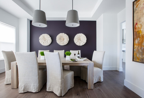
Photo by kmh design inc.
“Purple on its own may intimidate those who live in mostly neutral spaces, so think about using this shade on a single wall or the ceiling,” suggests Sasha Bikoff, an interior designer in New York City.
Your room will seem brighter and more welcoming with just a pop of this tone, she adds.
And when selecting a shade of purple, think in terms of rich tones—bolder, deeper shades of violet create an electric feeling on an accent wall, particularly when paired with complementary colors such as clean, grassy greens, Yeomans notes.
Her picks? Glidden Regal Purple or the more modern Purple Surf, especially in a dining room with warm wood furniture or flooring.
2. Lay down a purple rug
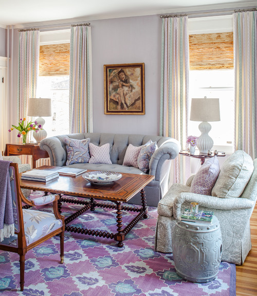
Photo by Susan Nelson Interiors
Those who are color-shy can introduce purple in subtle ways with wall art or rugs.
“A light purple rug adds vibrancy and personality,” Bikoff says, “but because it’s not at eye level, the room doesn’t feel aggressive or too bright.”
Or move into the hue slowly with a single item.
“A purple statement piece like a sofa, headboard, or armchair that uses rich textures—such as velvet and silk— brings excitement to the space,” she adds.
3. Try purple in a powder room
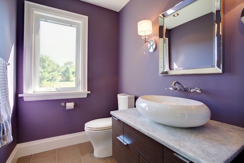
Photo by Slotegraaf Construction
Drew Henry of Design Dudes saves purple for a half-bath.
“These spaces are guest-centric and made to be impactful, so it’s the ideal spot to go a little crazy and showcase the latest trends,” he explains.
Paul Miller of MakeNest Interiors agrees: “Violet towels in a white bathroom are warm and luxurious,” he states.
4. Pair purple with unexpected colors
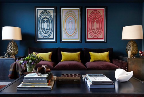
Photo by Charlotte Crosland Interiors
Purple doesn’t always have to be paired with its opposite on the color wheel. You can achieve harmony in your decor with some surprising combos.
“We love to add purple to a mix of blues and indigos for an unexpected twist on a classic palette,” Rassow says.
Case in point: The 2018 Pantone pick marries nicely with Oceanside, a deep teal that was named the Sherwin-Williams color of the year, Henry notes.
“I would also pair purple shades with gray and simple whites, though yellow would be a great color to accent with—just use it sparingly,” he adds.
And if purple is in your wallpaper pattern, match it with muted silver, pale pink, or even bright red, Bikoff says.
5. Use purple in your accessories
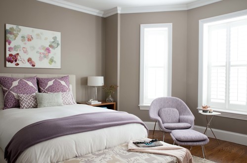
Photo by Justine Sterling Design
If you fear making a commitment to an eclectic hue, you can always dip your toe in the purple pool with accent pieces—think lamps, a bright throw, or vibrant pillows.
“Getting a few pillows for your couch or bed is a good way to test the trend and frees you up to switch them out next year at low cost,” notes Henry.
Flowers and houseplants are other easy ways to add a bit of purple.
“A potted purple queen adds beautiful color in a kitchen window or a softly toned guest room,” Miller says.
Or look to kitchen accessories in this shade, including a Dutch oven, blender, or dish towels.
6. Give purple to the kids
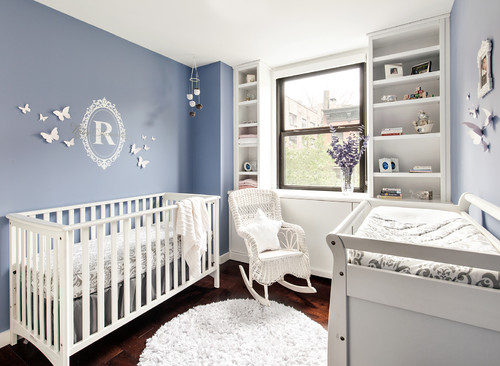
Photo by Shana Dee Nursery Decor
Purple is young and vibrant—and therefore the perfect pick for a baby’s nursery (try soothing lavender) or a tween’s bedroom (electric magenta).
“Violet shades invoke creativity and imagination, and make for great color choices in a kid’s playroom,” Yeomans adds.
To unite the space, pick bedding and window treatments that have a touch of purple in them.
“Muted purples are neutral enough to work in many spaces,” Yeomans says. “And a grayish purple, like Glidden’s Violet Verbena, has a chameleonlike presence that appears polished yet playful in children’s spaces.”
7. Steer clear of clichés
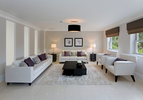
As with any color trend, it’s important not to make tired mistakes or mix in wild shades that aren’t cohesive. One sin from the past that designers want you to avoid: adding pops of purple—no matter the shade—into an all-white room.
“This was popular 10 years ago, but it should be long gone by now as it’s just plain tacky,” laments Bikoff.
And refrain from using multiple shades of purple or pink together, Henry warns.
“This look can very easily begin to clash,” he notes.
Finally, make sure to choose your shade of purple carefully.
“Purple [can] quickly look juvenile,” Miller cautions. “So keep the color sophisticated with a version that has red or bluish undertones.”
